
Transformative digital solutions
Accelerate your company’s online growth with our range of services. We offer fixed-price web builds, ongoing retainers, and one-off consultancy.


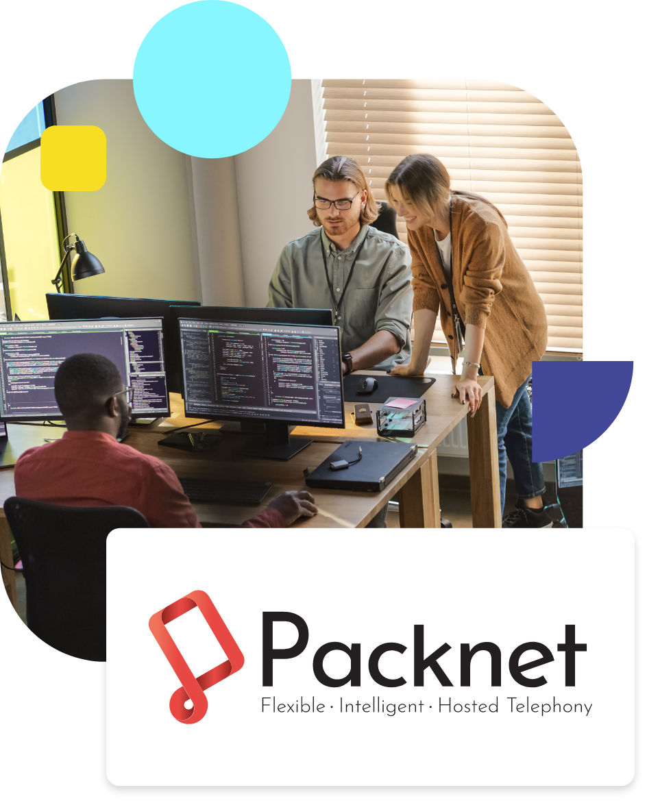
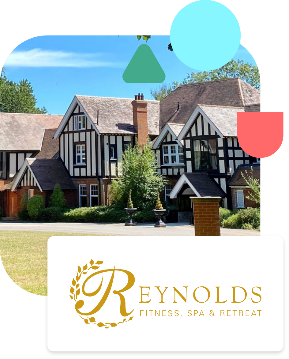
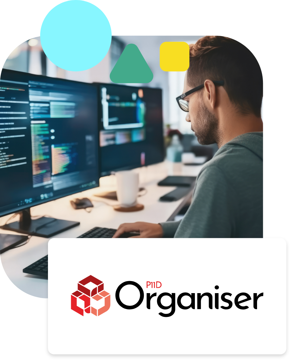
Our work
We work with enterprise and SME clients to create tailored high quality digital solutions.

